How to Make Your Virtual Session Presentations Stand Out

Online events are not new, but it took months of lockdowns and travel bans for the industry to finally consider them as a long-term solution. From conferences, summits, and trade shows, to training programs and career fairs – event professionals are innovating new formats and show flows to engage and excite remote attendees at virtual events of all types.
However, it’s important to realize that presenting at a virtual event is very different from in-person. In a virtual environment, there is a greater chance your audience will get distracted and lose interest.
So, as a presenter, you need to be doubly cautious in ensuring you engage your audience early on in your session and enhance the experience by delivering an effective presentation. Here are five ways to make presentations for your virtual event sessions stand out and grab attention.
Cover one takeaway per slide
Dedicate one slide to one concept – this is a golden rule and applies all the more to virtual event presentations. The last thing you want is for your attendees to squint at their screens to try and make sense of your presentation slides.
By keeping the text minimal and covering one takeaway per slide, you will be able to communicate more effectively without confusing viewers.
Let’s say you’ve inserted a timeline in the slide — refrain from adding supporting text on the same slide. Instead, elaborate on it while speaking. This will also give your audience a reason to listen to you.
As per the Glance Test, people should be able to take in your slide and its meaning within 3 seconds.
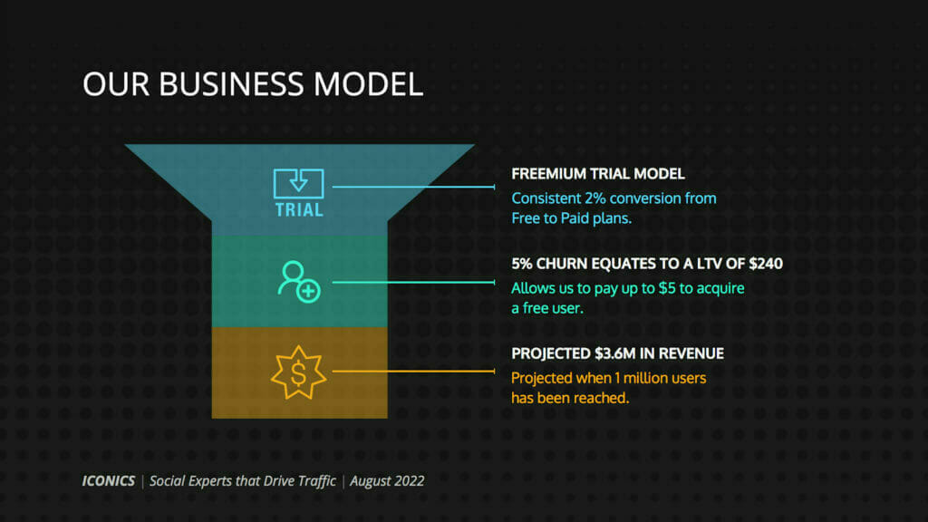
Here’s a good example of a focussed slide, devoid of any redundant information.

Keep the design simple and consistent
Your virtual session presentation’s design plays a huge role in generating interest and capturing attention. There’s no way cluttered and complicated slides can do that for you.
Choose a high-contrast color scheme and bold fonts that enables your presentation to stand out and aids readability. You can also play with font size and colors to emphasize and draw attention towards important details.
It’s important to keep in mind that people will be viewing your presentation on their desktops or smartphones as opposed to a projector screen. So, make sure you choose the appropriate font sizes and leave some empty (breathing) space.
Incorporate impactful visuals
If there’s one element that can take your virtual session presentations from boring to interesting, it’s compelling visuals.
Using visuals in your virtual presentation is likely to make it more persuasive and memorable because people respond better to visual aids. However, don’t just add visuals to ‘beautify’ your slides — use them to support your content and put your message across more effectively.
You can use visuals in the form of charts, graphs, icons, illustrations, business infographics, funnels, memes, GIFs and videos among others.

Use animation and motion
Another way to spruce up your virtual presentations and engage your audience is by using animated elements in your slides.
You can use animation to emphasize on aspects that lend to the overall narrative of your presentation. The idea is to capture attention, direct the viewers’ eye movement and aid storytelling.
While it’s possible to animate every slide, that’s certainly not a good idea because too much movement may end up overwhelming or distracting the audience. So, use it sparingly in areas where you might need to explain complex information or present a lot of data.
Make it interactive
You want your virtual presentations to be a two-way conversation as opposed to a speech. Retaining attention while presenting is a tough task and gets even more challenging in a virtual set up.
The best way to involve your audience is by delivering an interactive presentation and building a rapport with them. Here’s how you can make your presentation interactive:
- Use polls and questionnaires to drive engagement
- Ask open-ended questions while presenting
- Gather questions in real-time using a tool like Sli.do
- Host giveaways and contests
- Create ‘tweetable’ moments, encouraging attendees to tweet about the event/session
If the event is being hosted on a virtual events platform, you will be able to leverage native features to ensure you deliver the most relevant information to your audience at the right time. Side-by-side tools like Q&A, chat, live polls and surveys will help you personalize the attendee experience and gather feedback – and most importantly, include them in the conversation.
Conclusion
After all the work that has gone into promoting your session (from social media posts to bulk email blasts, don’t forget to let your own network know when and where you will be presenting), you need to make your efforts count.
So, follow these five tactics and you are sure to make your virtual session presentations stand out!
This guest post was written by Simki Dutta, a content marketer at Venngage – a free infographic maker and design platform. When she’s not working, she’s most likely to be found refreshing her Twitter feed.
