EventMobi Best Practices: Event App Home Screen Design

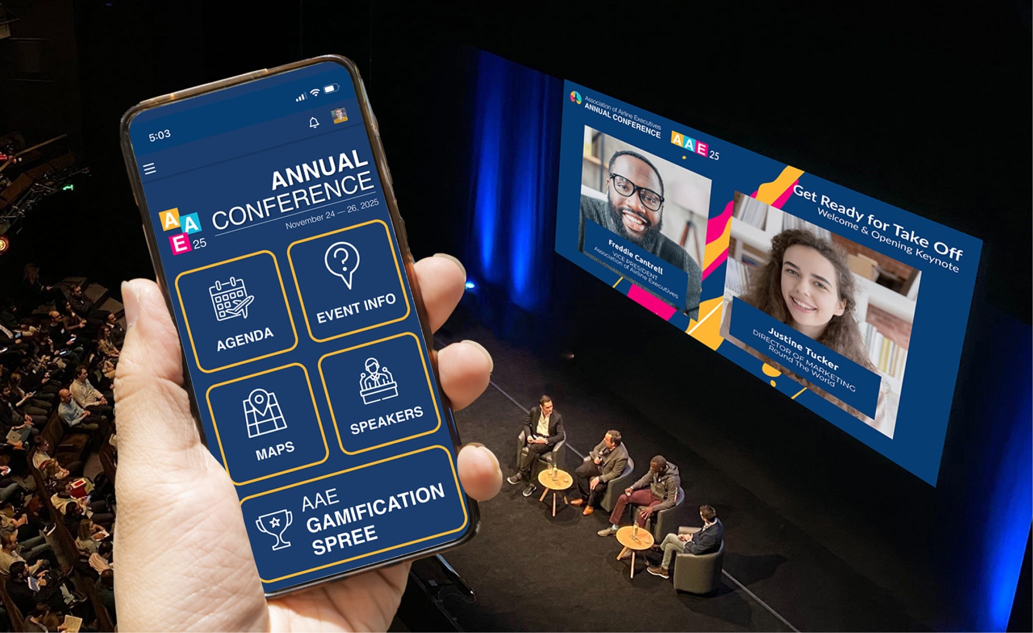
Branding and customization deliver more than just a good looking event app; they help set the tone and feel of the event and engage attendees with the content you’re sharing. Appealing to the senses of your audience can help encourage attendees to interact with the app, and create a connection between them and your brand or event theme. And it all starts with the event app home screen design.
The home screen is one of the first things that your attendees see when they interact with your event app. This means that setting a good first impression is critical to your app adoption. To help you create an incredible event app that will give that ‘wow’ factor for your attendees, we’re sharing a few suggestions and best practices when it comes to customizing the event app home screen.
What To Consider for Your Event App Home Screen Design
While EventMobi’s event app offers default home screen images (i.e. image widgets), creating your own custom images can make all the difference when it comes to creating an impactful impression and brand connection with your event attendees. The goal of image widgets is to connect your attendees with relevant content. This is done by linking the widgets to specific sections in the event app or external websites. Creating visually appealing images will help to capture the attention of your attendees and prompt them to interact with the app. You want to enable them to get the information they need as easily and quickly as possible or promote content that you want them to see.
To establish a cohesive experience, we recommend working with a graphic designer to create custom images that will reflect your company brand or event theme.
For EventMobi’s event app, to ensure the images are optimized, you’ll want to take note of the following parameters for web-based images:
- Pixels Per Inch (PPI): 72
- Colour Profile: RGB
- Size: 16 MB
Our image widgets are available in three default size options depending on your preference:
- 300 px Wide by 250 px High
- 600 px Wide by 250 px High
- 600 px Wide by 500 px High
If you don’t have access to a graphic designer or someone with design abilities, EventMobi provides design services as part of our professional services offerings.
Customizing Your Event App Home Screen Images
Once you know the framework for the images you will be creating, it’s time to start thinking about your overall design theme.
One of the first things you’ll want to consider, and arguably one of the most important factors of the home screen, is establishing a color theme that aligns with your event. Selecting the right colors will help catch the eye of your attendees and define your brand.

The next consideration should be the types of image widgets you want to use. Each widget should serve to promote your brand, while also indicating the content that it will direct your attendees to. Considering things like font styles, icons, and graphics all contribute to the overall aesthetic you’re looking to establish.
To give an additional ‘wow’ factor, consider using a series of smaller widgets that make up a whole image on the home screen.
Using gif files will also bring the event app home screen images to life.
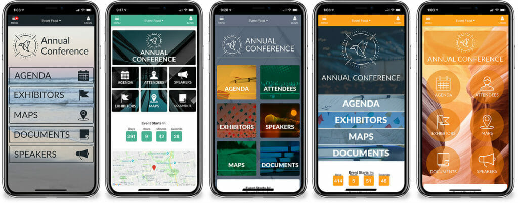
For more event app design inspiration, check out these examples from EventMobi clients.
Thinking Outside the Box
To create an event app that’s truly unique, a popular option with EventMobi’s clients is our Advanced Designer feature. It allows you to incorporate custom CSS to really bring your vision to life. CSS can be used to make changes to the overall style of the event app, including changing the shape, style, and spacing of home screen widgets and/or incorporating a background image to further emphasize your event brand.
Knowledge of CSS and design will be needed in order to make these types of changes, so you’ll want to make sure that you have a team member who’s familiar with these concepts. If you have the vision but lack the skills to make it a reality, consider our design service options.
In Conclusion
While design and branding may not be the first reason you choose to use an app at your event, it can play a very important role in user adoption and the ways attendees interact with your content. Having a well-designed event app home screen design can create an inviting space where users are encouraged to click into various sections of the app and review important details and information. Whether your design approach is rooted in minimalism, a love for color, or interesting graphics, the home screen is the foundation of setting the tone and feel for your event.
Related Resources:
Experience Design: A Complete Guide to Creating Memorable Events
Recommended Resource: 📺 Are you looking for cost-effective, easier ways to build and manage your events? Watch 8 short videos to learn how to deliver events in any format that engage attendees and offer sponsors more value—no matter your team size or budget!